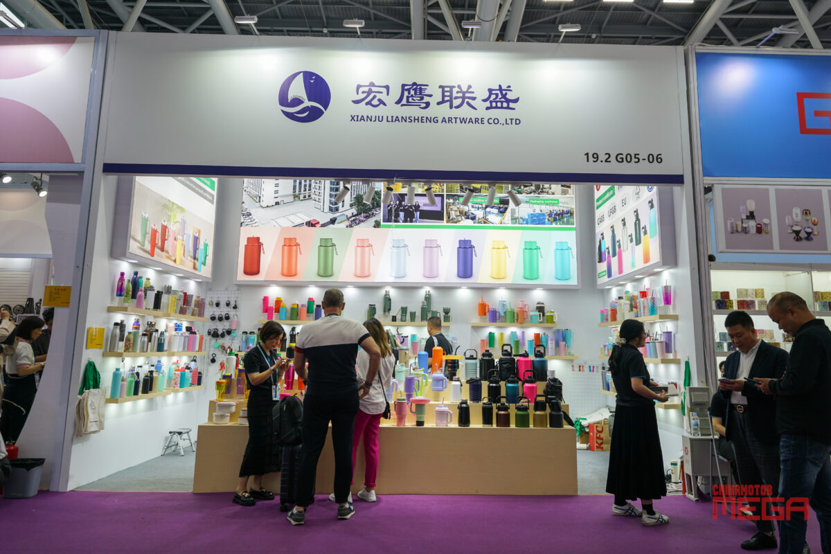
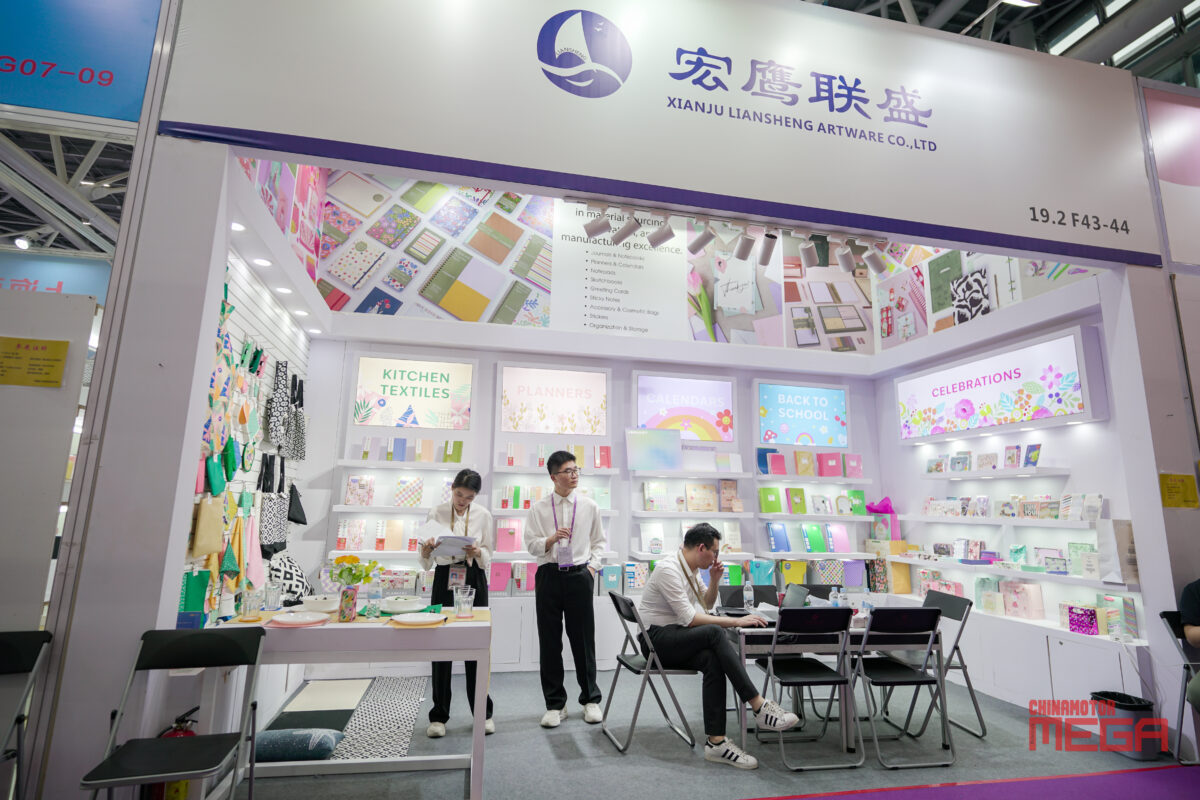
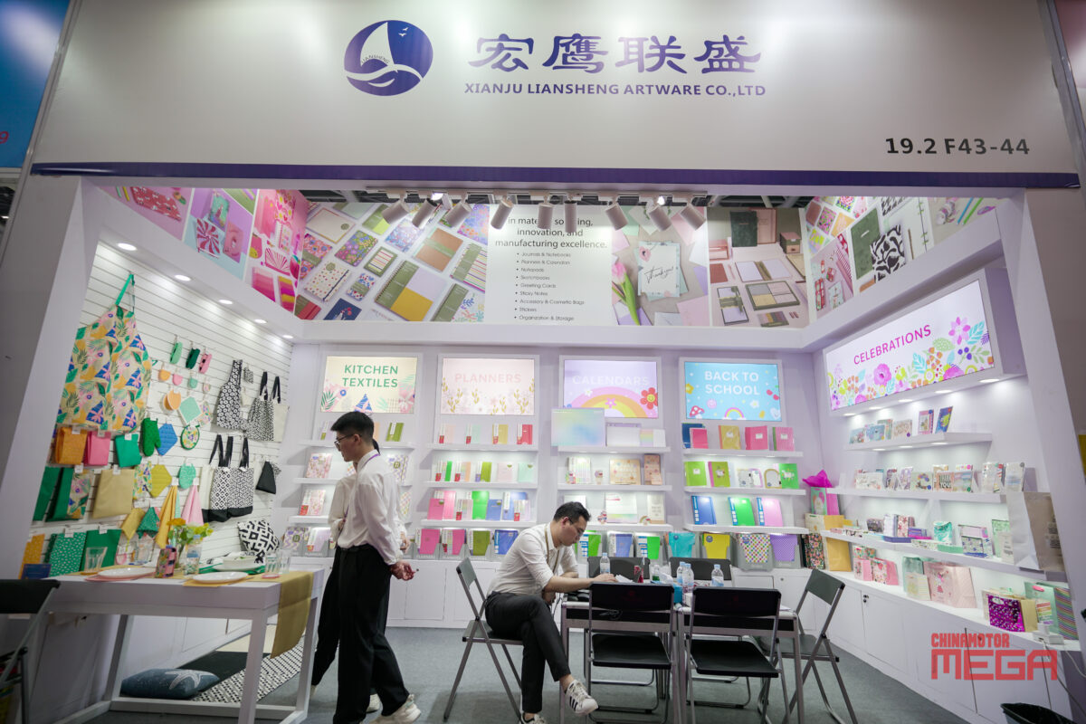
With white as the main color of the booth, to create a simple and bright basic atmosphere, with the product’s own rich colors (such as stationery powder, green, yellow, red, blue, purple, etc.), forming a visual sense of hierarchy. Not only does it highlight the diversity of products, but it also avoids the clutter of colors, and the overall style is fresh and lively, in line with the audience’s preferences for everyday necessities and cultural and creative products. : Distinguish product categories through signs, such as “KITCHEN TEXTILES”, “PLANNERS” and other plates in the first picture, and match with decorative patterns corresponding to the theme (such as green plant elements in the kitchen textile area and flower patterns in the celebration area) to strengthen regional recognition and guide visitors to quickly locate products of interest.


